My Favorite Cartoon Duck

Bjella Floor Emblem

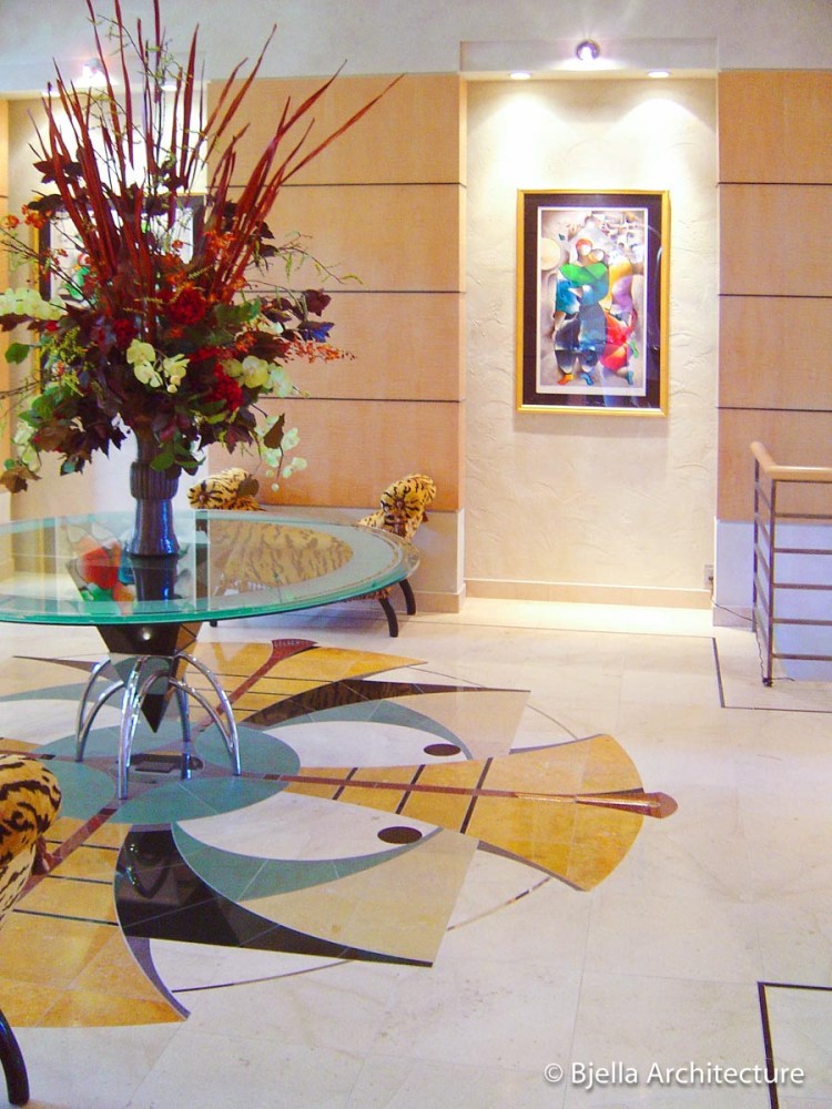
Designing anything unique has its pitfalls. Sometimes unexpected things happen, don’t work correctly, or a cartoon duck shows up! The design of this stone tile floor emblem is a great example. Most people never see it (I didn’t until a couple of years after the fact), but if you look carefully (o.k., casually will do), you may see my favorite cartoon duck (no, it’s not Donald). Of course, once you see it, you can never un-see it.

Designed to be elegant, now it’s an elegant conversation piece. Thankfully the homeowners appreciated the humor and wouldn’t change it now if they could.

Bjella Floor Emblem

Daffy Duck

Bjella Floor Emblem

Bjella Floor Emblem

This floor art was painstakingly crafted for us from granite, slate, limestone, marble and stainless steel by the artisans at NVR Surfaces (Formerly Warner Bros. Studios).

See more of my work at Bjella Architecture.

Rothenburg via Pencil

Traveling along the Romantic Road in Germany many moons ago, Robyn and I came across the very essence of picturesque. A town that almost oozes character. From this place you can imagine what medieval towns were like 1000 years ago. You may recognize it from the movie Chitty Chitty Bang Bang. Rothenburg was also used as a backdrop for some of the Harry Potter films. It was not, however, the town shown at the end of Willy Wonka and the Chocolate Factory. That was Nordlingen (I can’t believe you even thought that). 😉

A nice place to while away the afternoon with a pencil.

Rothenburg, Germany

Tim Bjella Sketches - Rothenburg

Tim Bjella Sketches - Rothenburg

Rothenburg, Germany

Tim Bjella Sketches - Rothenburg

Rothenburg, Germany

Tim Bjella Sketches - Rothenburg

Rothenburg, Germany

Rothenburg, Germany


https://bjella.com

Chasing Ghosts – A Minneapolis, Minnesota Modern Kitchen Design… and Re-design

Vent Hood Retrofit

Zoinks!!! It’s not often a kitchen demands an eight foot long vent hood to whisk away the smoke from a cooktop. Naturally, you don’t just walk into The Home Depot and purchase a beast like that, so we custom designed one. Not a very good one, though.

Turns out the vent hood didn’t work. Oh, the unit turned on just fine and looked fantastic! It just didn’t draw smoke out of the kitchen. Two out of three ain’t bad, right? … maybe if you are listening to Meatloaf, but not if you are cooking it.

What went wrong? I immediately suspected ghosts, of course. What else could it be? We had meticulously designed the perfect vent hood for this modern kitchen, accounting for everything down to the tiniest detail. We even specified a roof-mounted blower with the capacity to suck up a small child (although we never actually tested this). We figured we were pretty safe. The homeowners would just have to watch their children. 😉 We thought of everything. Almost.
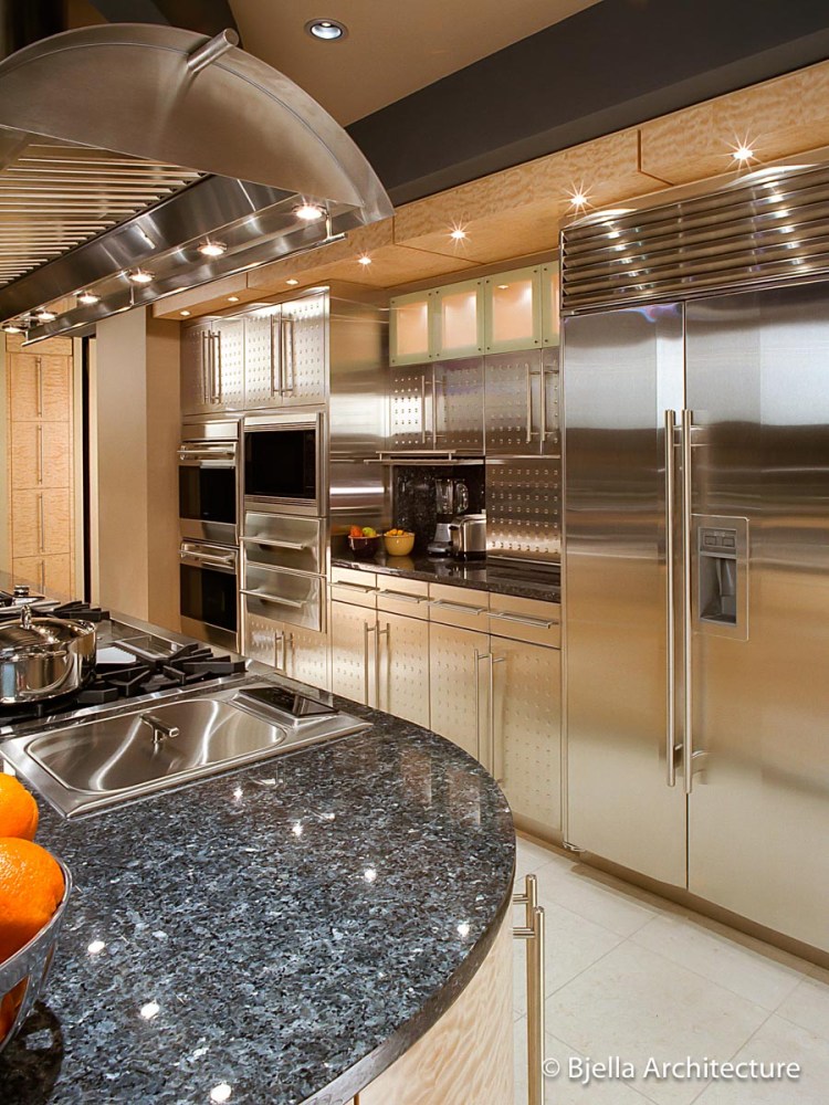
Vent Hood Prior to Retrofit

When the homeowners finished coughing and wheezing they called the Bjella Special Investigations Team (we’re thinking about getting a van like Scooby-Doo). You can imagine mag-wheels squealing and sirens blaring, the team scrambling to set up specialized computer equipment, drawing diagrams, frantically analyzing algorithms, referencing technical manuals and finally wandering around the kitchen with hand on chin saying things like “hmmm” and “very interesting”. Instead we just lit the burner and watched the smoke rise.

Long story short, I suspected a creepy looking ghost dressed like a man, or visa versa, and wanted to set a trap for it – and possibly have a chase scene. Robyn was skeptical. Cooler heads prevailed. The culprit was, anticlimactically, the house ventilation system. By lightly blowing across the center island, it was short circuiting the air flow from the cooking surface to the vent hood. Yet another reason to place cooktops against walls instead of on center islands (but that’s a topic for another day).

Fabricating a brand new hood would have been costly. We needed to come up with a fix like NASA had for the Hubble Telescope, except significantly less expensive… I take that back. We needed a fix NOTHING like NASA’s.

Because you are undoubtedly on the edge of your seat, sweat on your brow, the solution was simply to extend the hood and create more capture area on the side where the smoke was leaking out. In other words, we put a bill on the hat. Tada! It worked like a charm and, happily, looks even better than the original (oh, and we captured the bad guy. Turns out it was just a dude in a costume. Who would have guessed?).

Shown above is our certified kitchen and cardboard specialist, Robyn (Daphne) Bjella, affixing and testing the mock-up prior to fabrication of the stainless steel retrofit (I mostly sat around taking pictures and eating Scooby snacks – and watching for ghosts).

Vent Hood Retrofit After-2

Vent Hood Retrofit - After

Read more about this Minneapolis, Minnesota modern kitchen by Bjella Kitchen Designers in Trends Magazine.

The Perfect Pencil

Penxo Pencil

Often, people ask me what pencil I use to draw and sketch (by often, I mean nobody, ever). So here is my current favorite tool, recently received via Kickstarter. If you have a hankerin’ to put lead on paper, the Penxo pencil is for you. Minimalist, perfectly balanced perfection. Combine it with Koh-i-noor’s 4300/24 2mm lead for black, non-smearing goodness.

Penxo pencil

A great unadvertised feature: it’s also a pen! Simply slip a standard D1 pen refill in place of the lead.

[Edit 4/5/17: It appears the company is now out of business]

Unintentionally Anthropomorphic

Many years have passed since Robyn and I visited the romantic town of Rothenburg, Germany. A quick image search confirms it is still as picturesque as ever and, best of all, my favorite tower did not wander off. Huh? Wander off? Notice the stubby, little legs created by the archway!

I love unintentional anthropomorphic architecture! It is not unusual to spot an unintended face on a building, but this one has an entire body, including a distinct head defined by a thin stone ledge and a shoulder peeking out below that. Its face even has a mustache, nose, hair (not nose hair), cheeks and ears. This just makes me smile.

Rothenburg, Germany

The tower, Klingen Tor, was built in the thirteenth century to help fortify the medieval town of Rothenburg.

Can You Spot the Focal Point of this Kitchen?

Bjella Kitchen Design

Hint: It’s not the dust bunny in the corner (just kidding, there will NEVER be a dust bunny in this kitchen).

While the area that draws your attention is, in this case quite obvious, focal points are typically more subtle. Most spaces have one, although it is often unintentional and sometimes even unwelcome. When you walk into your own kitchen, are your eyes drawn to a pretty little flower in a niche or the dirty dishes in the sink?

This focal point is built in, yet, it doesn’t have to be. You can create one in your own kitchen and add some pizzazz with a simple flower, for example. But keep it simple. Less is more.

Bjella Kitchen Design - Focal Point Study

Notice the impact created in the kitchen above by the addition of a simple, small focal point. It does a few things. It draws the eye, providing a splash of color. It also breaks the symmetry of the cooktop area, making it more dynamic and visually interesting. In this case it is a focal point within the larger focal point of the cooktop area. Yes, a good design often has layers of focal points.

Bjella Kitchen Design 5

This focal point is two-sided, serving both the kitchen and the dining room. Two for the price of one!

See more of my work at Bjella Architecture.