 Step into my Wayback machine and I’ll take you on quick trip to 1994 – back to a time when I really, really, really needed a job. Really. Why did I need a job? Because, I stupidly quit a perfectly good one to start my own company – a house design company without any houses to design. And, did I mention, I desperately needed a project. Any project. If someone had asked, “Will you design a house for me?” They wouldn’t have gotten past “Will” before I replied, “Heck, yeah!”
“Doghouse?” “Sure!”
“Outhouse?” “One or two level, sir?”
“Cathouse?” “I… suppose I can do that.”
“No, no, not that kind of cathouse.” “Oh. O.k., (meekly) I’ll do it.”
 The reality of the world came down on me like a hammer (a hammer, I might add, that could have been better used to build one of the many house projects I didn’t have). I discovered the hard way that it’s a wee bit difficult to stay in business without any work. Not to mention, Robyn was tired, and just a little embarrassed, watching me on the street corner holding a cardboard sign (nicely lettered in architectural handwriting), “Will design your home with Pop Tarts.” I meant, of course, “FOR Pop Tarts.” Probably explains why no one stopped. I still don’t understand why Robyn never corrected me, though. I guess she thought it was some kind of artsy, architectural thing (O.k., I confess, that last part only happened in my recurring nightmares. I think. I hope.).
 Most people start their architecture companies as a spin-off from another company, with stolen clients and projects already in the pipeline. Or, they have wealthy parents, friends or connections to draw upon. I was foolish enough to try it without any of that. I quit my real job, spent my only savings on a few advertisements in a local magazine, printed some business cards and crossed my fingers. Look up “fool” in the dictionary. You will find my picture next to it (in full color, with flashing neon arrows pointing to it).
If you can imagine the cliché, love-struck, teenage girl waiting by the phone, praying for it to ring, you can almost picture me. Just add a slightly deeper voice, sweat, tears and a few expletives (maybe more than a few), and you have it. To answer the phone when it finally rang, I had to set down the toaster with which I was about to share a bath.
Hallelujah! I have an interview!
Setting up the interview for the following week turned out to be a snap. Preparing for it was even easier. I had nothing to prepare. My portfolio was empty. My resume was as blank as my stare. I had NOTHING to prove that I was capable of doing the job. I had never designed a house (although I liked houses very much, thank you, especially the one I dreamed of living in someday). I spent five years after college working on very large commercial buildings, and not one of them had so much as a bedroom.
So what qualified me to design a house? Again, nothing. To land this job I needed to rely entirely on words – to talk my way into the job by painting a picture of the client’s future home. My mantra for the days leading up to the interview alternated between “Be one with the home, young grasshopper” and “Don’t blow this, idiot.”
Finally the day came. After sitting in my car for an hour on a neighboring street to ensure I wasn’t late (listen up youngsters, you could learn a thing or two), I drove into the driveway of my prospective client . Was I nervous? Let’s just say you couldn’t stuff more butterflies into a stomach without a ram rod (and that just makes a mess). Or, jitters into a chest. Or, ants into a pair of pants for that matter.
Straightening my ill fitting suit and tie (again, pay attention, youngsters), I rang the doorbell, all the while chanting “don’t blow this, idiot.” After the door opened, a man stepped out holding a tiny dog that couldn’t have weighed 5 pounds. In my most charming manner I said, “Hi, I’m Tim. Nice to meet you. What a cute, little dog. I have a Labrador Retriever. She could eat your dog for lunch.” The man looked me in the eye, quivered ever so slightly, and replied, “For dinner yesterday, my neighbor’s German Shepard ate her brother.”
(Damn)
Yes, this really happened. Sadly it is not the dumbest thing I’ve ever said, either. But I still have all my teeth, so that’s a plus.
How does the story end? It’s a multiple choice:
- I lost the job, but learned an important lesson (yeah, right). Go ahead, guess this one. I dare you.
- I got the job, proving once again you can be a smart ass and things will always go your way. Oh, and I lived happily ever after.
- The man turned to me and said, “I’m so glad one of these yappy things is finally out of my hair. I just wish the Shepard had saved room for dessert. Come inside, young man. I like the cut of your jib.”
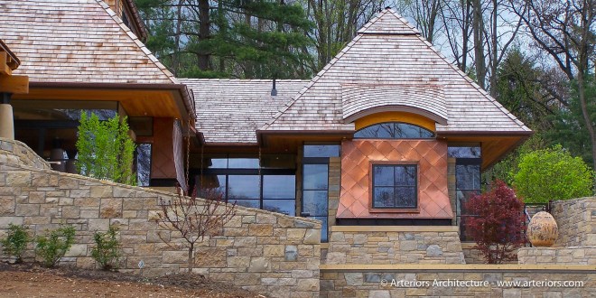
 And the real ending is…. a modified number 2. Happily ever after, yes, but only because I got lucky. This time the faulty connection between my brain and mouth didn’t land me in hot water. It should have ended my career. Instead, I got the job and published in Architectural Digest to boot. Not all my doing. The bulk of the credit and thanks goes to a thoughtful, kind and generous client (and now dog-less friend).
Stay tuned for before-and-after pictures and to read the rest of the story.


 Step into my Wayback machine and I’ll take you on quick trip to 1994 – back to a time when I really, really, really needed a job. Really. Why did I need a job? Because, I stupidly quit a perfectly good one to start my own company – a house design company without any houses to design. And, did I mention, I desperately needed a project. Any project. If someone had asked,


